
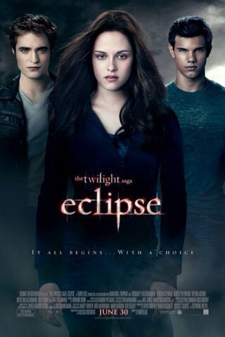
So now that we have seen all three treatments, which movie poster is your favorite? Via Novel Novice
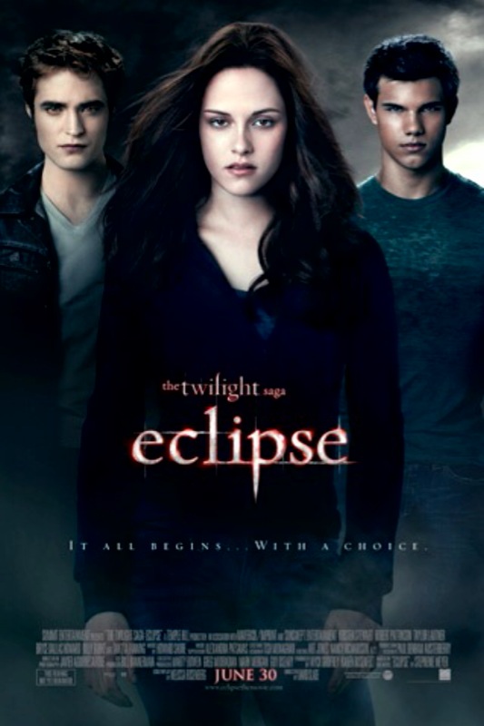
Eclipse One Sheet Poster Revealed
March 23, 2010
A Twilight Saga Fansite
So now that we have seen all three treatments, which movie poster is your favorite? Via Novel Novice
Follow Us!